

Introduction
Categories of Postcards
Landscapes
Houses
Businesses
Churches
Civic
Uses of Postcards
Lost Beverly
Use of Colorization >
Dynamics
What was Written
Postcard Publishers
Beverly Post
Cards
Modern Day
Use of Colorization
by Joanie DePietro
Colorization is the process that is used in postcards in which the photograph on the front of the postcard is sent to other countries to enliven the photograph with color, making it more attractive to the consumer. Before postcards were printed in color, greeting cards for certain holidays such as Christmas and Easter were colorized. The first firm for color manufacturing was in Leith, Germany. Called "Lundy", they were the first ones to start printing business messages in color. Soon, color was what people liked most about postcards. Although the first postcard was published on 1869 in Germany, it was not until 1893 that the photos on the postcards were colorized. The popularity of colorization arose when the postcard act was changed in 1898. It transformed the postcard regulations, the development of postcards and the color was changed to beautify the postcards and make it a more profitable product. After the colorization of postcards the postcards sold in stores became more successful than ever [1]
![[1]](jdepietro/1.jpg)
Publishers often sent their photographs for postcards to India and Italy. These countries specialized in using exotic colors on photographs to catch the eye of the common person. At first this was an ingenious idea, but it caused many problems later. All the postcards were sent to Europe and India because there Lithography was an art. Since the people in India and parts of Europe had never been to Beverly before, when they received the postcards to be colorized they used their artistic imagination. They used lush colors , although the photos were extravagant one could usually see that the colors were not accurate with the photo. Tourists could see a certain photo of a landmark in Beverly and be disappointed because the colors of the original landmark were completely different from the photo.[2] In these two pictures, the first depicts a photograph of the United Shoe on Elliot street in black and white. The second photo depicts the same picture in color, but it is not accurate. Looking at the building the viewer can clearly see that the Shoe was not brick. It is a duplicate of the original picture because the same cars are in the parking lot and the whole scene is exactly the same. Another photo from Beverly that had been colorized numerous times, each time being different colors was William Howard Taft’s summer home in Beverly .There are four pictures that show the same house in all different colors. This shows that in the twentieth century for postcards, people did not care about the authenticity of a photo on a postcard, but only the attractive colors that intrigued the consumer. [3]
![.[2]](jdepietro/2.jpg)
![[3]](jdepietro/3.jpg)
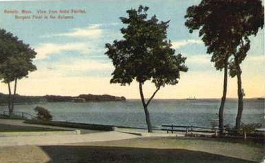
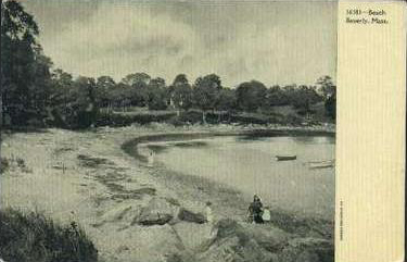
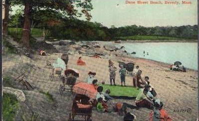
The photographs of beaches in Beverly show how colorization could make an ordinary beach look like paradise, even though it was not authentic. There is a colorized picture of Burgess point in Beverly. The other two pictures show Dane street beach. One is in black and white with no people at it and the other is of Dane street colorized and with many people. The pictures show how colorization has a major effect on a picture.[4][5][6]. The two photos of the Cabot house show that the colorization helps make the landmarks in Beverly look more attractive , so more tourists will flock to Beverly and anywhere else that colorization was used . The more color that was used the more people were attracted to the place on the photo.[7].
![7]](jdepietro/7.jpg)
Today when postcard collectors and historians are looking at pictures of Beverly they prefer the photos that are in black and white. They find them more genuine and Precise. The colorized postcards are useless when trying to find a historical landmark. In the twentieth century colorized postcards were a fad, but today there is a certain nostalgia for postcard that is in black and white. The colors that once seemed remarkable and beautiful are now unreliable and artificial.
Next chapter: Dynamics of Postcards in Beverly
![]()