

Introduction
Categories of Postcards
Landscapes
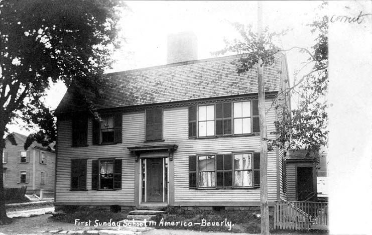
Houses
Businesses
Churches
Civic
Uses of Postcards
Lost Beverly
Use of Colorization
Dynamics >
What was Written
Postcard Publishers
Beverly Post
Cards
Modern Day
The Dynamics of Beverly Postcards
by Tim Wear
The dynamics of postcards have evolved greatly over time, changing their
overall look. There are some postcards that look much different then those
from the time of their creation. The sizes, shapes materials, and the
overall set up have all varied over time. Some of these changes affected
Beverly Massachusetts, while others didn't. Beverly had its own dynamics
of postcards as many other places did.
Postcards as you may already know are not very large. They have always
been rather small since their creation. Early on in the life span of the
postcard there was a standard size widely used in the United States of
3 ½ inches by 5 ½ inches. Almost as large as the majority
of modern cards which are approximately 4 inches by 6 inches. Beverly,
on the other hand, had it's own unique size, 3 ½ inches by 6 ½,
for postcards from the earliest to the most recent. Not all postcards
have to follow these size restrictions, and there are many exceptions
to these rules, but for the most part these are the sizes of postcards.
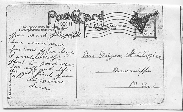
There are many differences on the front and back of the Beverly postcards.
One thing that was always the same on the back of the postcard was the
area for the stamp in the top right hand corner. It remained in this spot
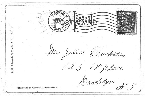
throughout all the changes and remains the same to this day. The earlier
cards used the entire back of the card only for the address only, reading
"This Side For
Address Only". To compensate for this lack of room to
write on the back, the majority of these postcards had an area to write
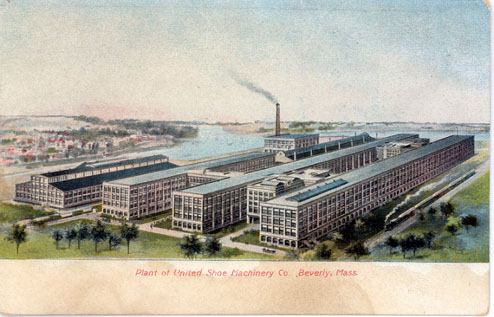
on the front, this area was blank could be found on any edge of the card.
These cards could be of anything such as the United
Shoe. Some, however, did not have any space to write which
left people scribbling over the picture, or writing in the empty sky.
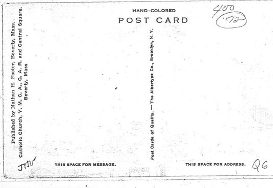
As time went on the law restricting writing on the backs of postcards
was lifted and a new appearance of the back was introduced. This new
appearance had a line splitting the left and right sides so
that the right side could be used for the address and the left for the
message. After this happened the percent of cards with a space on the
front dropped greatly. A rather small number of cards had lines or the
address, the non-divided
had the least percent, but it seemed that more of the more recent, divided
back cards had them.
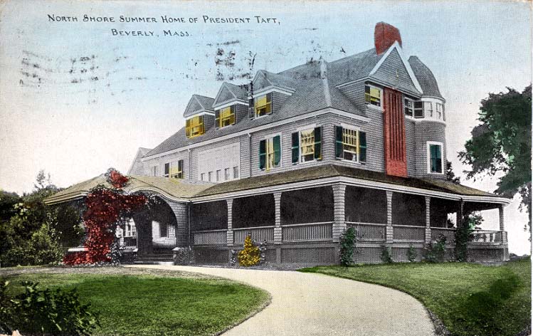
Older postcards had no color when the photo was originally taken. The
only way to have color postcards was to ship them overseas and have them
colorized. For this reason, many were just left black
and white or an odd shade of brown. The ones that did have
color seemed rather phony, and the color schemes were unrealistic such
as this picture of president Taft's
summerhouse. Many don't just look unrealistic but they look
almost hand drawn. They are of streets in Beverly and other places of
interest such as the rose garden or post office. The more modern cards
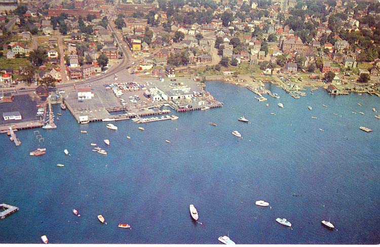
can be, and are taken in color. There are a few that are black and white,
maybe to give a more authentic look. The most recent cards have the best
color and have views that were not obtainable at earlier times. This comes
with the invention of the helicopter. There are many pictures of the waterfront
and other spots that can easily catch a person's eye.
The outside world had many things in postcards that Beverly did not. All
of the Beverly cards are made out of a stiff piece of thick paper. This
was the same for most cards but there are some cards out there made from
birch bark and other strange materials. There are also many textured cards,
which Beverly is missing. Linens for example weren't really that uncommon
but Beverly had none. One type of card that Beverly did have are chromes,
which simply have a very glossy look to the front of the card. All of
the Beverly cards are in the 3 ½ by 6-½ inch norm, but the
rest of the world did not stay in any boundaries and as a result many
abstract cards have been made. Beverly is also missing of these abstract
postcards. Beverly was rather conservative with their postcards, showing
very little creativity other than the pictures used. The photographer
or artist is the only one who made any attempt to change the dynamics
of the postcard.
Beverly had its own unique design of postcards that no other place had
by its subtle differences. The size and lack of abstract ideas and other
variations in the dynamics make these postcards original. While the world
was doing one thing Beverly was doing the same thing in its own unique
little way.
Sources
Collins, C "Interesting Facts about our Postcards" Hobbies, July 1952, 150-152
"Historic Beverly Postcards and Images". Primaryresearch.org.
, 18, October 2002
2002 <http://www.primaryresearch.org/postcards/index.htm>
(18 October 2002).
Staff, Frank.The Picture Postcard and Its Origins. New York: Frederick
A Praeger, 1966
Next chapter: What was written on the back
![]()